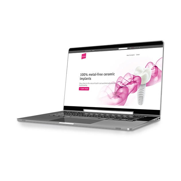
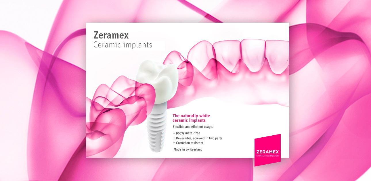
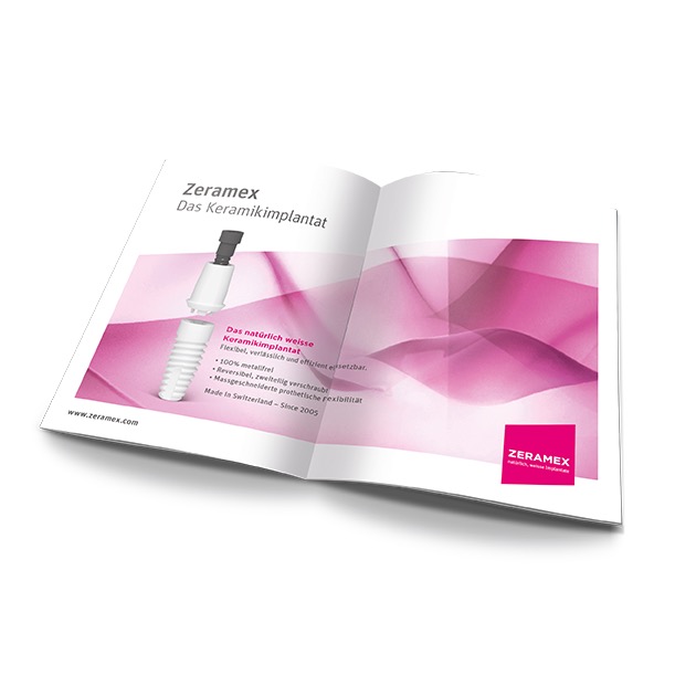
hurdle
hurdle
hurdle
loading...
zeramex-hero-image2.jpg zeramex-hero-image-mobile.jpg
Screenshot 2020-11-27 at 11.26.40.png

A new positioning for Zeramex: naturally, white implants

The brand of Swiss company Dentalpoint AG has been developing and manufacturing all-ceramic dental implants since 2006. It offered the world's first metal-free, two-part ceramic implant with a screw connection.

Zeramex

The task

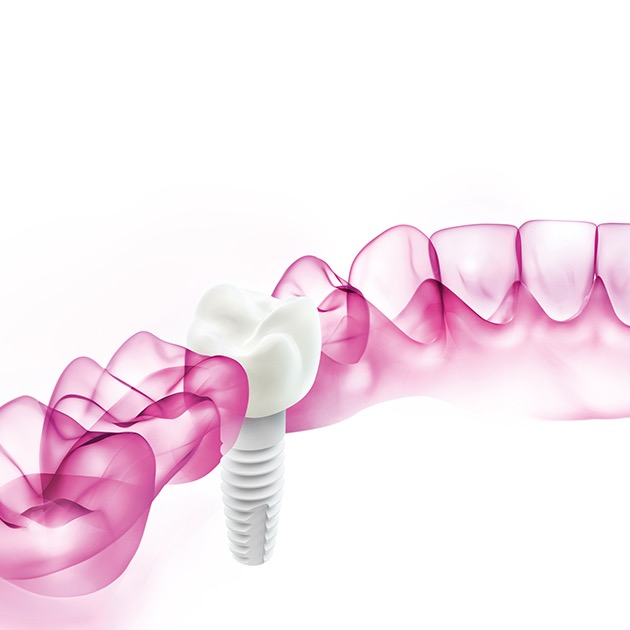
The dental implant market is very dynamic. The task was to position Zeramex as an attractive high-end alternative to titanium and to secure the category leadership in ceramic implants. The project included the identification of relevant target groups, the development of positioning and brand story as well as their activation.

W3c
zeramex-content-image1.jpg

Analysis, hypothesis, result

The project was carried out according to the Kunde & Co process, which has proven itself in many projects: After extensive desk research on markets, trends and positioning, we conducted personal interviews and used a detailed online questionnaire to test hypotheses and the perception of various relevant brands among dentists, implantologists and dental laboratory technicians.

W3c
zeramex-content-image2 (1).png

Clear result: target group women

The result was clear: Due to demographic change, not only is the basic need for implants steadily increasing, but we also discovered women as taking more influence. On the one hand, an increasing proportion of women practising medicine can be observed. On the other hand, for aesthetic reasons, female patients have implants twice as often as men and choose higher-quality systems. Another observation: The competition in the titanium sector positioned itself with the topic of "strength" rather masculine. Thus it was clear - we should focus and ensure high affinity from the female target group in our visual expression.

W3c

The natural white approach

Our goal was to establish Zeramex as the brand for ceramic implants that offers dentists a complete ceramic solution of the highest quality and aesthetics to complement conventional titanium implants. With the concept of “naturally, white implants” we relied on the naturalness of the material ceramic compared to titanium and staged it in a visual universe that pays tribute to the topics of design, aesthetics and high quality. Since the analysis had also shown that the company colour pink was a regular identification feature for Zeramex, we kept this but used it more consciously and subtly.

W3c
zeramex-content-image3.png

Concise implementation for all channels

Today, pink-transparent, exposed teeth that look like a 3D scan form the background for the presentation of the white, attractively presented products. We implemented the new look consistently on a large number of elements. The creative department of Kunde & Co designed a new logo and a unique image style, advertisements, original product packaging, but also a website update and new social media content. Zeramex now has a toolbox with powerful media at hand to address the new target group stringently and convincingly.

W3c
zeramex-content-image4.jpg

What we delivered

  • Positioning
  • Desk research
  • Interviews
  • Online survey
  • Brand history
  • Visual identity
  • Logo
  • Advertisements
  • Product packaging
  • Online elements
  • Social media content
W3c

Want to know more?

Henrik Kattrup

Partner - Country Manager, Switzerland
Read more

Scroll to see the next Client Story

Danfoss - Positioning an intelligent component as ‘value adding’

To find out more about what Kunde & Co can do for you and your company, please contact us


Contact us
W3c

Join 3,000 of your peers 

Get a dose of articles and cases on strategic marketing

W3c

Thanks for being a part of our network


W3c