hurdle
hurdle
hurdle
loading...
heroal_Case_00_Herobanner.jpg mobile_1.jpg
nets logo.png

International branding for a Nordic fintech company

Nets helps banks, companies and stores alike to make the lives of their customers easier by offering safe payment methods. Nets, with headquarters in Denmark, delivers its services to more than 300,000 stores, 240,000 companies and 240 credit institutes throughout Scandinavia.

nets

The task

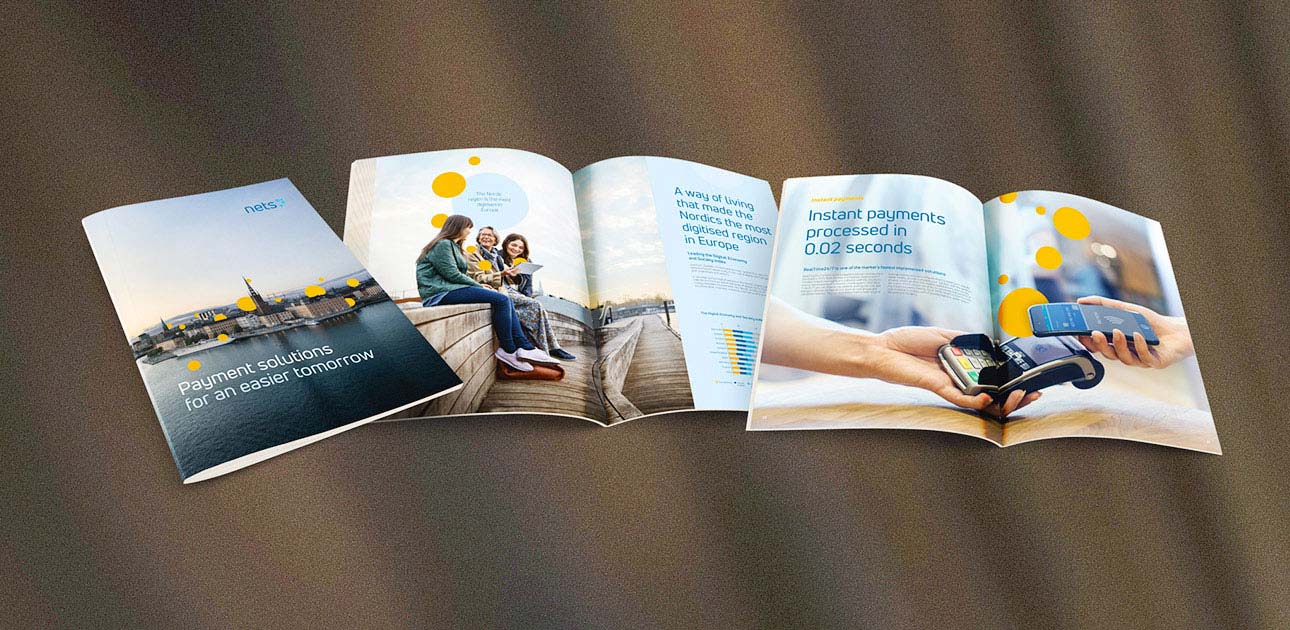
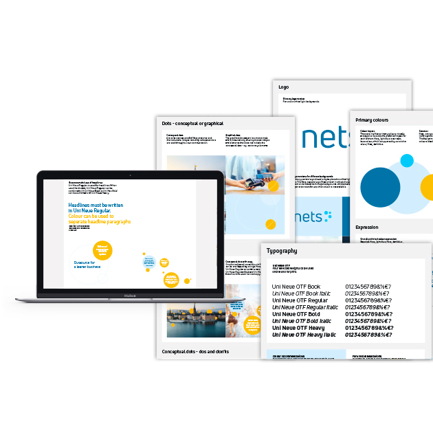
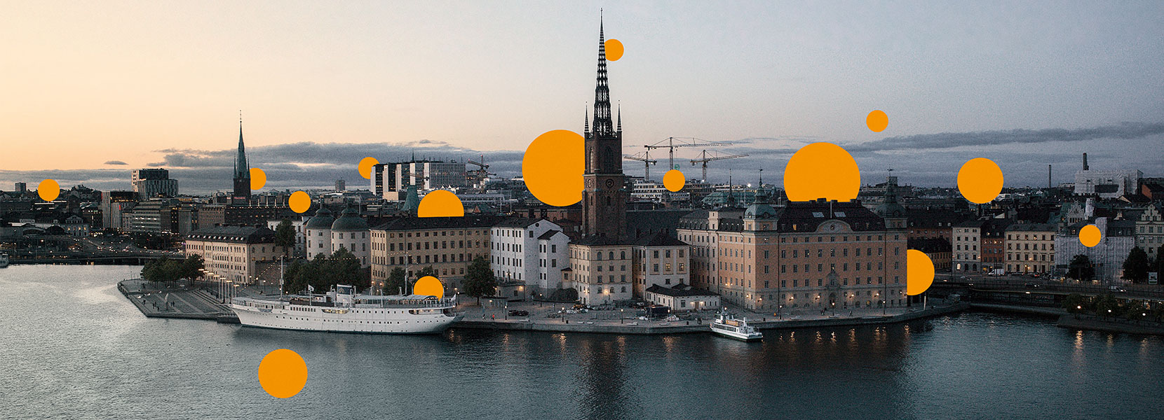
After a period of organic growth, as well as some acquisitions, the payment solution provider saw itself confronted with the challenge to unify the Europe-wide expanding company behind a common identity and value position. That’s why Nets started a positioning project with Kunde & Co to create a new purpose and a coherent core message.

W3c
atboCase_01_Fact_IMG.jpg
mobile_2.jpg 02_Film.jpg

Need for an expanded brand story

Preliminary analyses and interviews showed that Nets had a strong brand position in Denmark, due to its popular brands Dankort, NemID, eBoks and Betalingsservice. But an expanded and significantly more aligned message was needed. At the same time, the qualified recognition of Nets over Scandinavia was to be heightened, especially through highlighting the company’s role in the digitisation process and in making everyday life easier. Lastly, a clear and precise perception of the company’s many innovations and improvements for the customers was yet to be established.  

W3c
Recognition (1).png

Comprehensive testing

Based on this analysis, we created a framework for Nets as an orientation and guideline for further development and expansion of their current perception. On this foundation we developed several directions for a Nets brand message. We visualised and described them and then conducted quantitative testing, with 800 employees from Nets, as well as more than 3,000 external participants from Denmark, Norway, Sweden and Finland. 

W3c
mobile_3.jpg image.jpg

The brand’s most important driving forces

Testing results showed that it could be to Nets’ advantage to point out how the company has made everyday life easier for decades now. Additionally, the results pointed out that the interviewees wanted to know more about Nets’ innovations in the payment services sector. That’s why “easiness” became a keyword in the new core message, which connects past and future. As a new purpose, the slogan “An easier tomorrow. Powered by Nets” was created. All this became the foundation for positioning, core message and future communication and marketing solutions, supported by the new visual identity that we had developed alongside.

W3c
IMG.jpg

Careful internal anchoring

An internal anchoring process generated support, understanding and enthusiasm for the new business strategy. It started with a two-day kick-off event for management executives, who were summoned on an abandoned military airbase and sent on a joint mission with communication activities and obstacles. At this event, we presented the new visual identity and core message for the very first time. Just a few days later, the complete new concept was rolled out in every country.

W3c

External launch

After the internal kick-off, the new strategy was then implemented within external activities, to promote the new core message and also to communicate: This is how Nets and its partners make everyone’s everyday lives a little easier. The project started in 2017 and was a part of Nets’ business strategy for the period from 2018 to 2022.

W3c

What we delivered


  • Research and analyses
  • Comprehensive market surveys
  • International branding
  • Positioning concept
  • External and internal anchoring
  • Visual identity
W3c

Want to know more?

Nils Koch Jensen

Partner
Read more

Scroll to see the next Client Story

Hilding Anders

To find out more about what Kunde & Co can do for you and your company, please contact us


Contact us
W3c

Join 3,000 of your peers 

Get a dose of articles and cases on strategic marketing

W3c

Thanks for being a part of our network


W3c